Designing a re-entry system for users dropping out of a complex onboarding
ROLE
User research, interaction design, prototyping, dev handoff
CUSTOMER/CLIENT
Pigtie
TOOLS
Figma, Flutter, Firebase
METHODS
Customer Journey Mapping, Qualitative data synthesis, Tracking/analytics analysis, Moderated Usability Testing
Pigtie is a microinvesting app that rounds up small amounts from users' checking accounts into a custodian account. To invest, users must complete a multi-step sub-onboarding journey with an affiliate partner — including inputting sensitive data and completing an ID verification (in person, via video call, or via German e-ID).
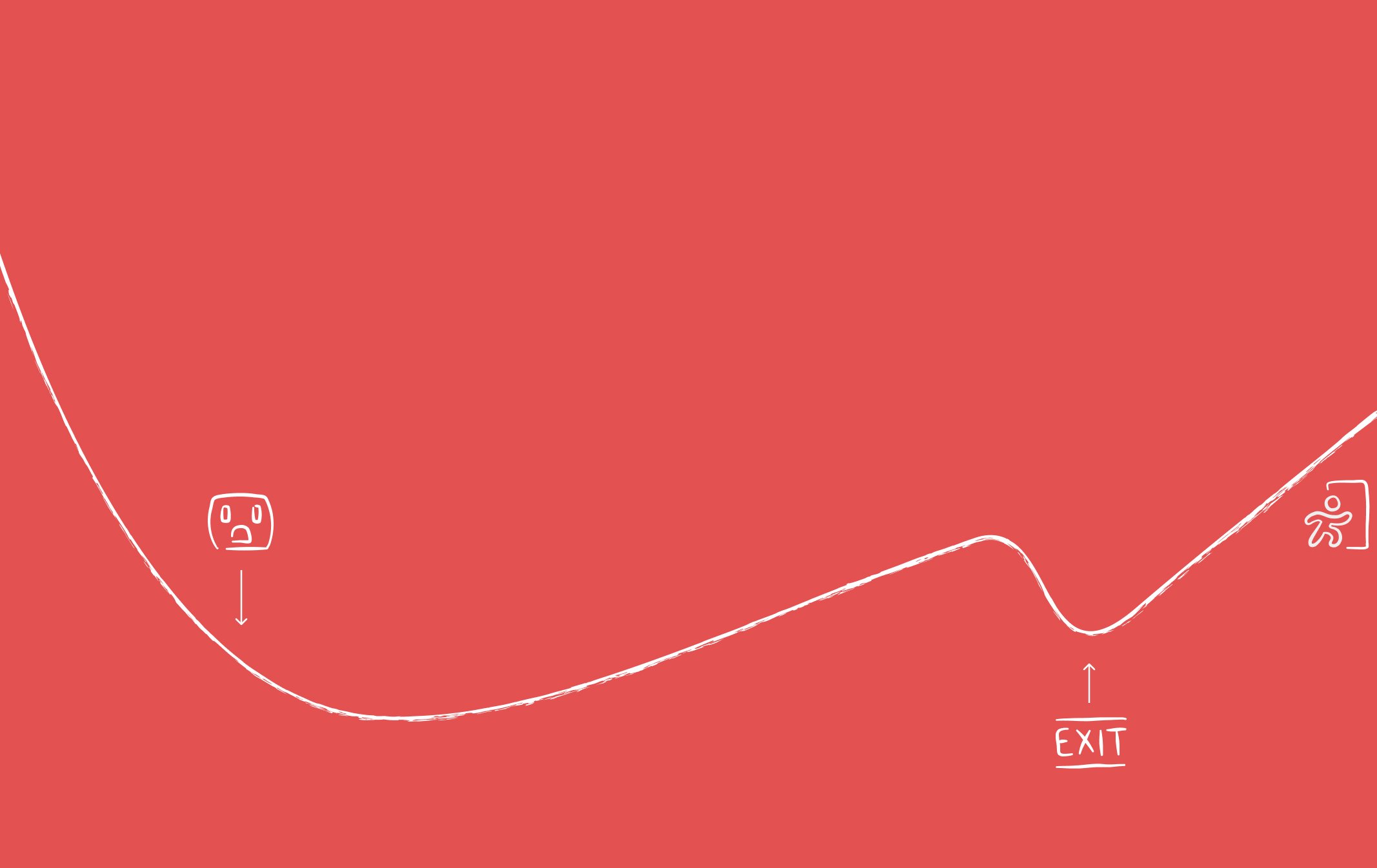
This journey, embedded in a WebView, was the biggest drop-off point in the entire onboarding. Users abandoned mid-journey due to missing documents, unsuitable contexts, or technical issues, and rarely returned — despite needing a custodian account to use the app at all.
This meant the goal wasn't actually to reduce drop-outs themselves, but to increase the rate of users who return and eventually convert. I was the sole designer on this project, covering research, prototyping, usability testing, stakeholder communication, and handoff — including helping write code like Firebase events in Flutter.
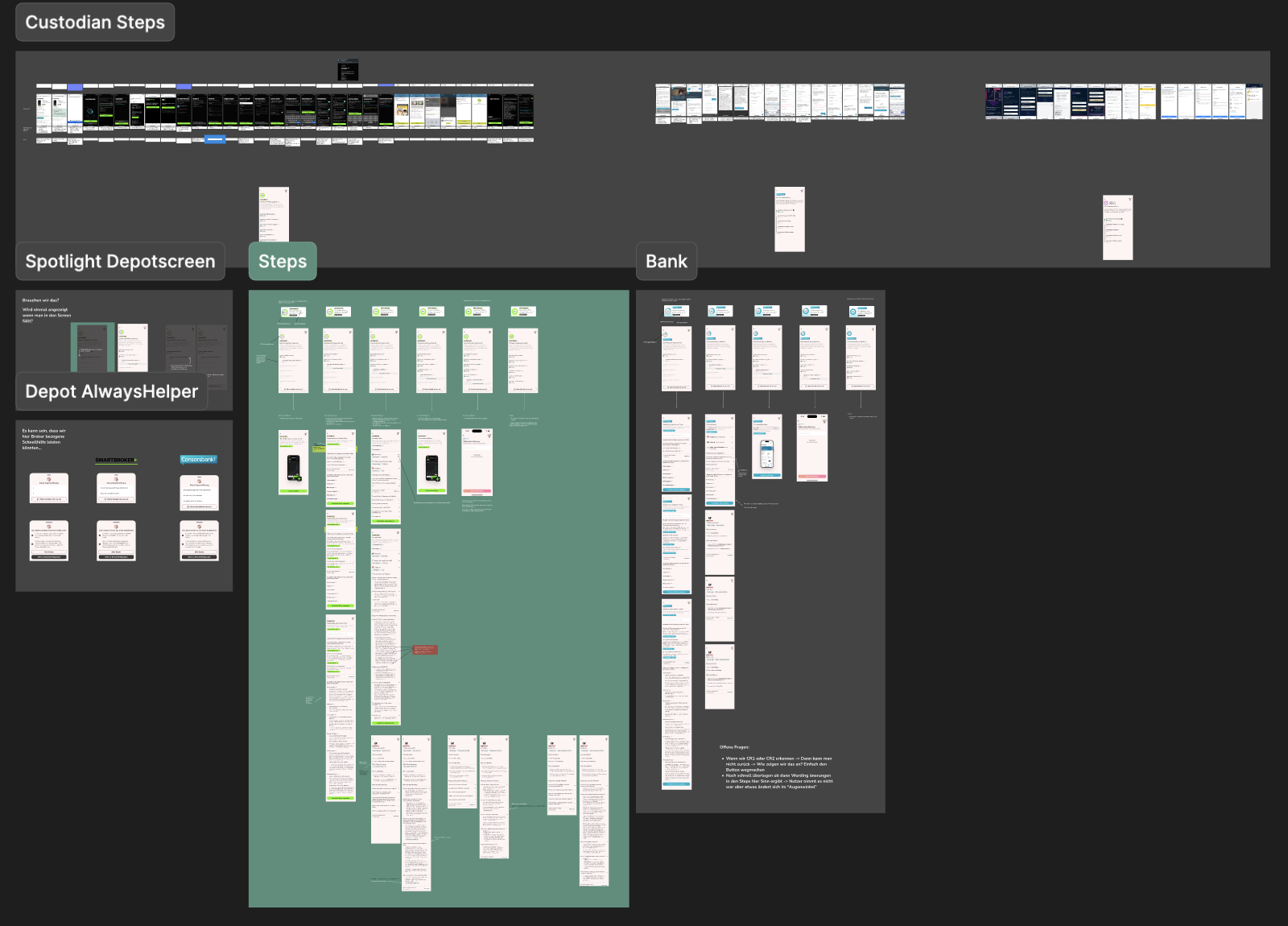
A core constraint: the affiliate journeys were external, meaning tracking was limited to URL changes and a handful of events. To work around this, I mapped all affiliate journeys in detail, identified which steps could be measured, and combined this with existing usability test data and user insights from customer care.
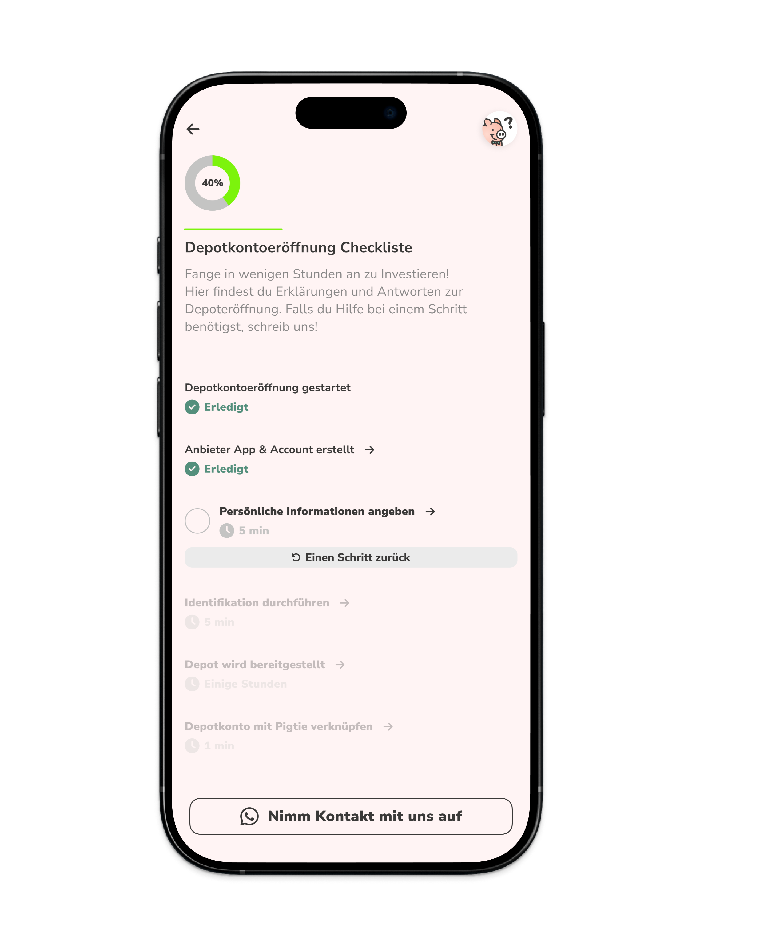
From this, I designed a checklist screen serving as a "safety net" — a structured overview of the most critical journey steps that users land on when dropping out of the WebView. Each step on the checklist was selected because it was either complex, required data users often didn't have on hand, or wasn't completable in every context (e.g., video verification on a bus).
Each checklist item linked to a subpage with targeted FAQs (built from 30+ usability tests), links to further information, and a direct re-entry point into the journey. The overview showed users how far they'd already gotten — often 1–2 steps — and displayed time estimates to counteract the perception that account opening is a long, daunting process.

A persistent progress card on the home screen allowed users to return at any time, and was removed automatically upon successful connection.
The checklist was adapted per affiliate partner, as each journey had a different structure.
An initial version allowed users to freely check off steps in any order. Rapid usability testing (n=3, click prototype combined with the real affiliate journey) quickly revealed this caused confusion — users clicked around non-linearly and lost orientation. The insight: this wasn't a personal to-do list, but a guided journey that had to be completed sequentially.
The revised design only allowed forward progress — and backward movement only as far as tracked data confirmed the user had reached. This reduced aimless navigation and increased arrival at the final connection step. A second round of tests (n=3) confirmed the improved clarity and usefulness, particularly when users dropped out due to technical issues mid-journey.

A lightweight notification system was added to bring users back at contextually relevant moments, with timing informed by estimated processing times (e.g., bank letters, form processing).
After two months post-launch, the targeted metric, return-and-convert rate among identified drop-outs, improved, particularly for users picking up longer-abandoned journeys in a more suitable context. The design also proved to be flexible and efficient - designs could be adapted to new affiliate partners or different contexts very fast (in less than a day) - also thanks to a robust stickerbook and design system already built up by me over the years.
In hindsight: Deploying an improved exit-intent dialog earlier in the project (a previous overlay had near-zero response rates) could have provided sharper qualitative focus from the beginning. I feel like continuous data collection should have been higher priority at the start of the project, so data collection could be planned during the design process with more intent and goal-orientation.