Designing an individual finance manager using PSD2

As groundwork to represent a full financial profile, the challenge was to design a account dashboard, which can be used by anyone, disrearding their financial situation.

ROLE

CPO, UX Designer, User Researcher, UI Designer, Interaction Designer

CUSTOMER/CLIENT

Pigtie

TOOLS

Figma, VSCode, Tally

METHODS

Co-Creation, Usabilty Testing, User Stories, Affinity Mapping

Background & Goal

Pigtie is a micro-investing app on a mission to help younger users (18–32) take meaningful steps toward long-term financial planning and self-directed wealth accumulation. The product started with a round-up service — automatically routing small amounts from a connected checking account into a custodian account — as a low-friction entry point into private retirement provision.

But investing consistently is only one side of the equation. To genuinely support users in building financial confidence and making better decisions, the team recognized a need to expand well beyond saving. This project was born from that ambition: an exploratory, full-cycle UCD initiative to identify and build new features that would give users a richer, more actionable view of their finances — powered by the existing PSD2 interface.

There was no predetermined design direction beyond the mission statement, which made this one of the most open-ended and multi-layered projects I have worked on. It moved through exploratory research, iterative concept development, a closed beta, and a full release — and as of 2026, the resulting feature has become the core concept of the entire app (see www.pigtie.de).

Core technical and product constraints:

  • New features had to be self-contained and must not interfere with the round-up feature, which was already seeing heavy usage
  • Only data available through the PSD2 interface could be used automatically; anything beyond that would require manual user input
  • The feature was to be a premium feature - meaning a paywall had to be placed. The team decided to try and put it into one tab of the main navigation to make the premium wall placement easier and continue with the self-contained theme.

UX Approach

Phase 1 - Exploratory Research

Given the open scope, the research phase was extensive and intentionally broad.

Competitive audit — A thorough review of the personal finance app landscape: finance managers, banking apps, financial literacy tools, trading platforms, and other PSD2-based products. This provided a map of existing approaches, common patterns, and gaps worth exploring.

Online questionnaire — An open-ended survey covering what users wished existed in apps aligned with Pigtie's mission, what problems they encountered with current tools, and what they felt was missing from the market entirely. Screen concepts were included at the end of the survey (not the beginning) to avoid priming bias, and were rated on a Likert scale.

Co-creation workshops — Three full-day workshops, each with five participants, all facilitated by me. Each session followed a structured arc.

Examples of prompts and written down wishes/user stories

  1. An open conversation about money — personal relationships with finances, frustrations, aspirations. I prepared 30+ prompt questions drawn from the audit to keep discussions moving across different financial domains, without leading participants toward any particular conclusion.
  2. Participants wrote down any thought they found interesting or relevant on post-its throughout. These became invaluable for understanding implicit priorities and later for constructing user stories.
  3. As sessions progressed, questions became more focused — shifting toward feature ideas and concrete scenarios. This fed into a co-creation phase with pre-prepared mockups, where participants could sketch, annotate, and iterate freely.
  4. For participants who needed more structure, predefined thematic areas (savings, transactions, budgeting, etc.) served as starting anchors.

Examples of created paper prototypes

Research outcomes:

  • A rich qualitative dataset of ideas, frustrations, and mental models around personal finance
  • A comprehensive set of user stories and scenarios, clustered into themes and organized into epics
  • Paper prototypes as starting points for feature and UI development
  • A clear design direction for the next phase: an individual, multi-banking financial hub — a personal finance cockpit — that would:
    • Display financial data from the PSD2 interface in a clear and understandable way, giving users full visibility into their financial situation
    • Offer tools to support planning and execution: budgeting, goal setting, saving
    • Feel approachable, modern, and built for a younger audience
    • Lay the groundwork for a future guidance or coaching layer across a user's full financial profile

Personas, User Journey (Happy Path), User Stories, Pain Points

Phase 2 - Concept & Design

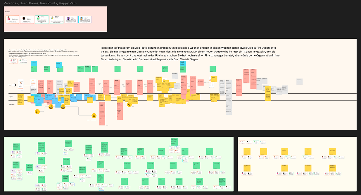
With the research outputs and paper prototypes as a foundation, multiple design directions and concepts were developed and evaluated.

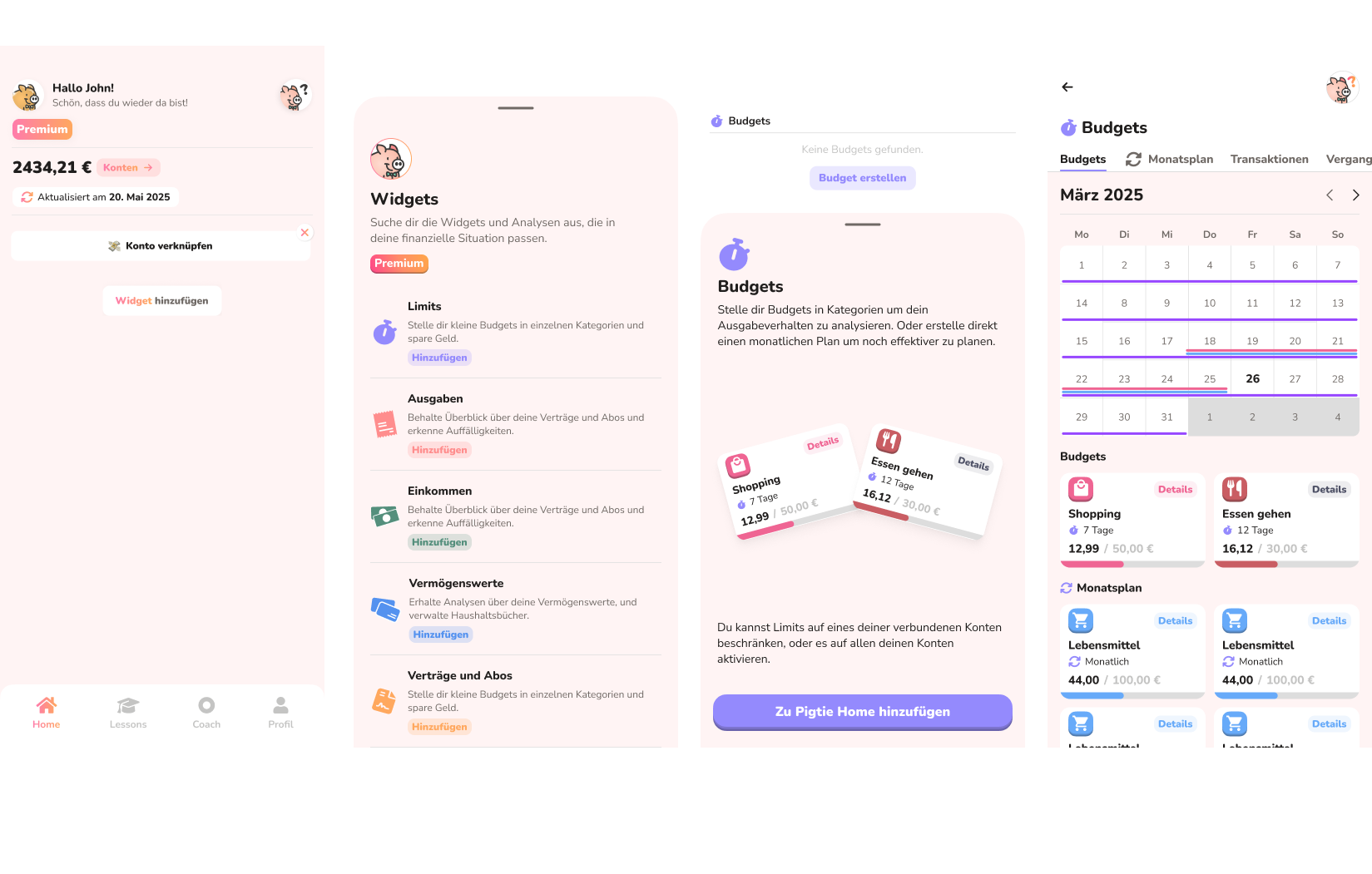
The central challenge was individualization. The research had made one thing very clear: financial profiles vary enormously between users. A one-size-fits-all dashboard would inevitably feel irrelevant to large parts of the user base. At the same time, the feature needed to remain self-contained within a single tab, and could not interfere with the round-up feature already in use.

After exploring several approaches, a widget-based dashboard emerged as the most promising solution — and became the concept taken forward into A/B testing. Its key advantages:

  • Users build their own view by selecting the widgets most relevant to their situation, making the experience inherently personal
  • Widgets serve as both data displays and entry points into functionality, giving users agency over the depth of their engagement
  • Financial circumstances change over time — a liabilities widget can be removed once a loan is paid off, for example — making the system naturally adaptive
  • From a development perspective, new features can be introduced as discrete widgets without disrupting the existing experience, enabling easier in-app testing and iteration
  • The dashboard fits neatly within a single tab and remains fully self-contained
  • The round-up feature can seamlessly be integrated as a widget at a later stage

Phase 3 - Testing

The initial designs were tested through a combination of methods:

A/B testing — Conducted in controlled one-on-one interview sessions using a Wizard of Oz approach, with high-fidelity Figma click-prototypes. Tasks were assigned and experience quality was measured with the UEQ (User Experience Questionnaire).

Online questionnaire — Included screen versions of the concepts alongside qualitative questions about features and user preferences.

Following a clear decision on the overall UI direction, more focused usability testing addressed specific interaction patterns: adding and removing widgets, the UI of widget detail screens, and various data visualization approaches. The starting set of widgets for the initial launch was determined based on a combination of usability test findings and the earlier research data.

A closed beta was then planned and executed, using an MVP implementation of the final design. Feedback was collected across multiple channels, including dedicated WhatsApp groups.

Implementation & Results

Road to release:

  • A full design system and component library (sticker book) were created in Figma
  • A complete dev handoff was structured with clearly scoped project packages, tickets, and ongoing communication via GitHub and Linear
  • I contributed directly to development, coding frontend and UI in Flutter
  • The closed beta was supervised end-to-end, with in-app-event data analyzed in combination with qualitative user feedback

Post-release results:

The project was considered a success against its goals:

  • Users actively engaged with the new features, and first-week subscription targets were met
  • Existing user behavior around the round-up feature remained unchanged — the new feature had no negative impact on core product usage
  • UI reception was positive across questionnaire scores and follow-up usability testing

Reflection

This was one of the most ambitious projects I have worked on — building a complex, multi-feature system from scratch, navigating an open brief through research all the way to a live product. It taught me a great deal about designing and shipping large-scale feature systems.

What I would do differently:

  • Scope management — The project grew too large. In retrospect, launching with a fixed dashboard first — and evolving it toward customization in a later iteration, or offering the widget view as a separate step — would have been the more pragmatic path. Incremental delivery would have reduced risk and tightened feedback loops.
  • Parallelizing development earlier — Development took longer than expected, as the entire system needed to be built before anything could ship. Defining the components that were certain to exist regardless of testing outcomes earlier in the process would have allowed backend logic and frontend architecture decisions to proceed in parallel with UX iteration, rather than sequentially.
  • UI system planning — Working alone on a project of this scale exposed some gaps in my design systems thinking at the time. Assigning a distinct color to each widget, for example, created a constraint that had to be walked back later. Similarly, the approach to information density and layout took several iterations to get right. These were valuable lessons — but ones I would now address during the design system phase, before any prototype goes into testing.