A case about discovering the design power of a context-driven all-purpose LLM Chat

ROLE
CUSTOMER/CLIENT
TOOLS
METHODS
Pigtie's personal finance app helps younger users manage their finances through a multibanking dashboard of activatable widgets — budgets, saving goals, expense analysis, and micro-investing — complemented by lessons and a financial health score. The logical next step was an integrated AI assistant: a "Financial Coach" that goes beyond customer care or contextual help to become an active part of a user's financial journey.
The key ambition was functional depth — the coach had to be capable of executing actions directly within the chat (like creating a budget), so users never needed to leave the interface to complete a task. This made the design challenge more complex than a typical chat UI.
Two clear goals shaped the work: give users practical power to complete journeys inside the chat, and actively guide them toward next steps.

The foundation was built on established mobile chat conventions, adapted to Pigtie's visual identity. The more interesting design work was in the extensions that made it fit the financial and learning/beginners context.
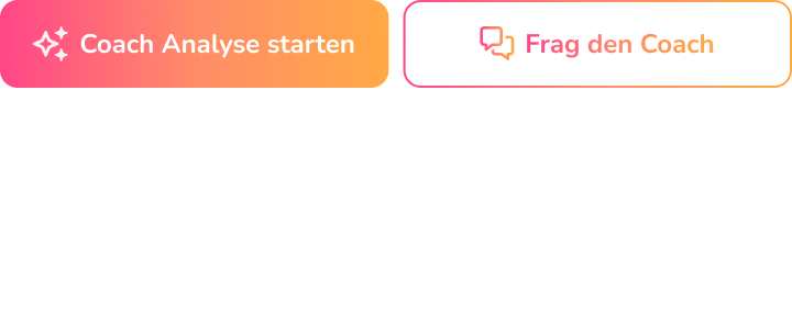
Prior user interviews and questionnaires revealed two dominant reasons for entering the chat: a focused, context-specific question, or an unfocused "I don't know where to start" state. Designing for these two distinct user intents separately — rather than forcing both into a single entry point — was a deliberate Jobs-to-Be-Done decision. This shaped the two entry points: a standard chat icon accessible on every screen, and a "1-Click-Planning" button that bypassed the blank opening state entirely and jumped straight into an analysis — directly addressing the blank slate problem, where an open-ended prompt with no starting point creates friction and hesitation rather than engagement. This could be done due to the very focused scope of the feature - it's intention is to provide financial guidance. In a general LLM the users intentions are way more varied, so a designer can probably not guess the goal of a user's first message
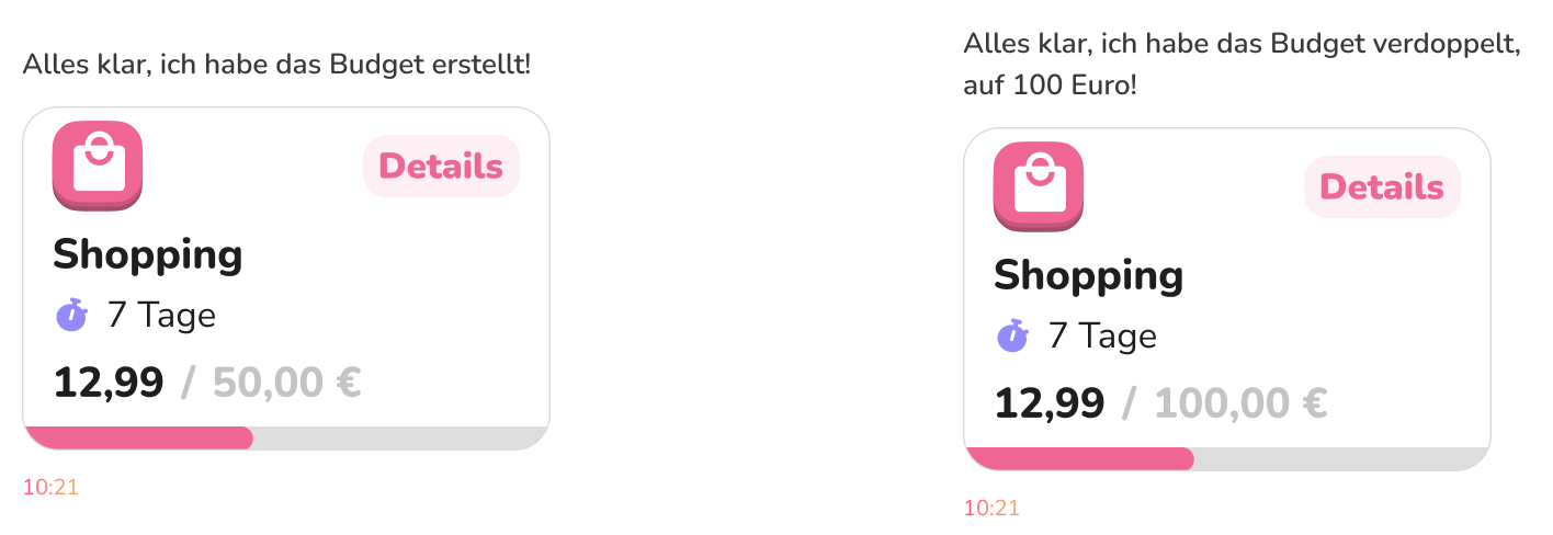
Several UI additions made the chat context-aware: an agent generating relevant in-app navigation links below messages, source links to Pigtie's own blog for further reading, and actual UI objects rendered inside the chat. Rather than telling a user their saving goal was created, the chat displayed the real, interactive UI element inline. Beyond recognition over recall, this also reduced cognitive load: users didn't have to mentally translate a text description into what the widget actually looked like - they simply saw it. It also doubled as a feedback system, showing changes to the elements normally visible while editing in the conventional UI based system.
Four high-fidelity, CI-consistent chat prototypes were designed and animated before any development began, each depicting a different target journey. A series of controlled usability tests identified interaction issues (e.g., scrolling behavior) and informed UI refinements, which were handed off to development as clearly defined goals.

Tone of voice required particular care — finances can mean delivering unwelcome news, and getting the balance between warmth and credibility wrong in either direction causes friction. This is a trust calibration problem: too cheerful undermines credibility when delivering bad news, too formal creates distance. The right register had to be earned through testing, not assumed. Much of this was refined in the live version, which led to the feature entering a closed beta with a select group of premium users.
To improve the AI model iteratively, a thumbs up/down feedback system was implemented directly beneath messages. Thumbs-down responses were reviewed case by case — wrong links, incorrect data, tone issues — and used to retrain and adjust. This was participatory design in production: rather than treating launch as the end of the design process, real users became active co-designers of the model's behavior over time. The closed beta scale made this sustainable: a smaller, more engaged user base allowed for active follow-up on feedback and customer care requests.
The beta launch produced went well, the core design was well received, and users engaged with the feature in the ways intended. It was subsequently released as the first public version, iterated and continued to develop over the following months.
The clearest personal lesson came from a misstep around written feedback collection. The instinct was to add a new screen with a text input field triggered by a button near the thumbs icons. Stepping back made the answer obvious: the chat itself was already the right place to collect written feedback — the input field was right there. It was a good reminder that AI chat interfaces are genuinely multi-purpose surfaces, and that thinking in discrete UI screens can get in the way of seeing what's already available.