A successful case study about complex journeys and sensitive data

ROLE
UX-Designer, UI-Designer, User Researcher
CUSTOMER/CLIENT
Pigtie
TOOLS
Figma, Notion
METHODS
Controlled Usability Testing, Prototyping
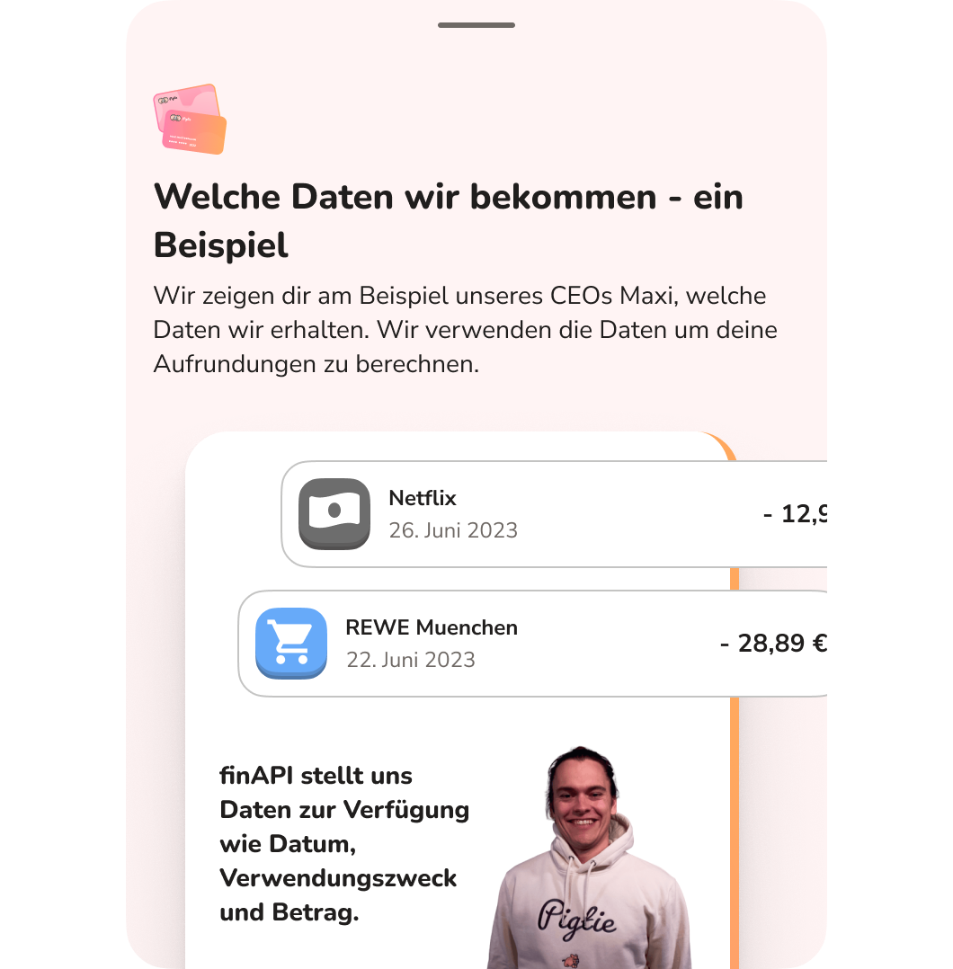
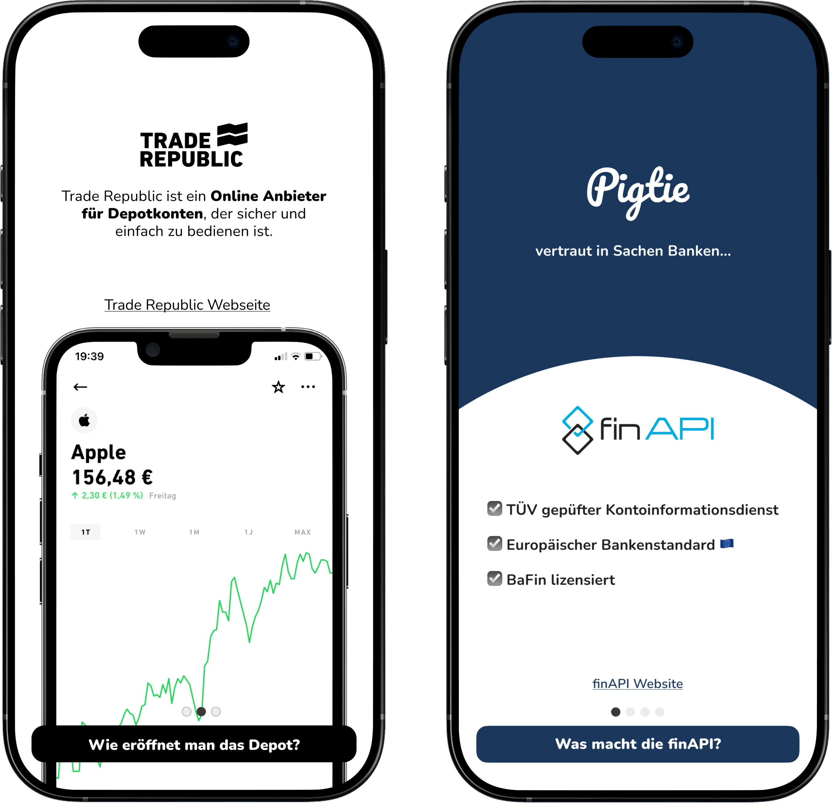
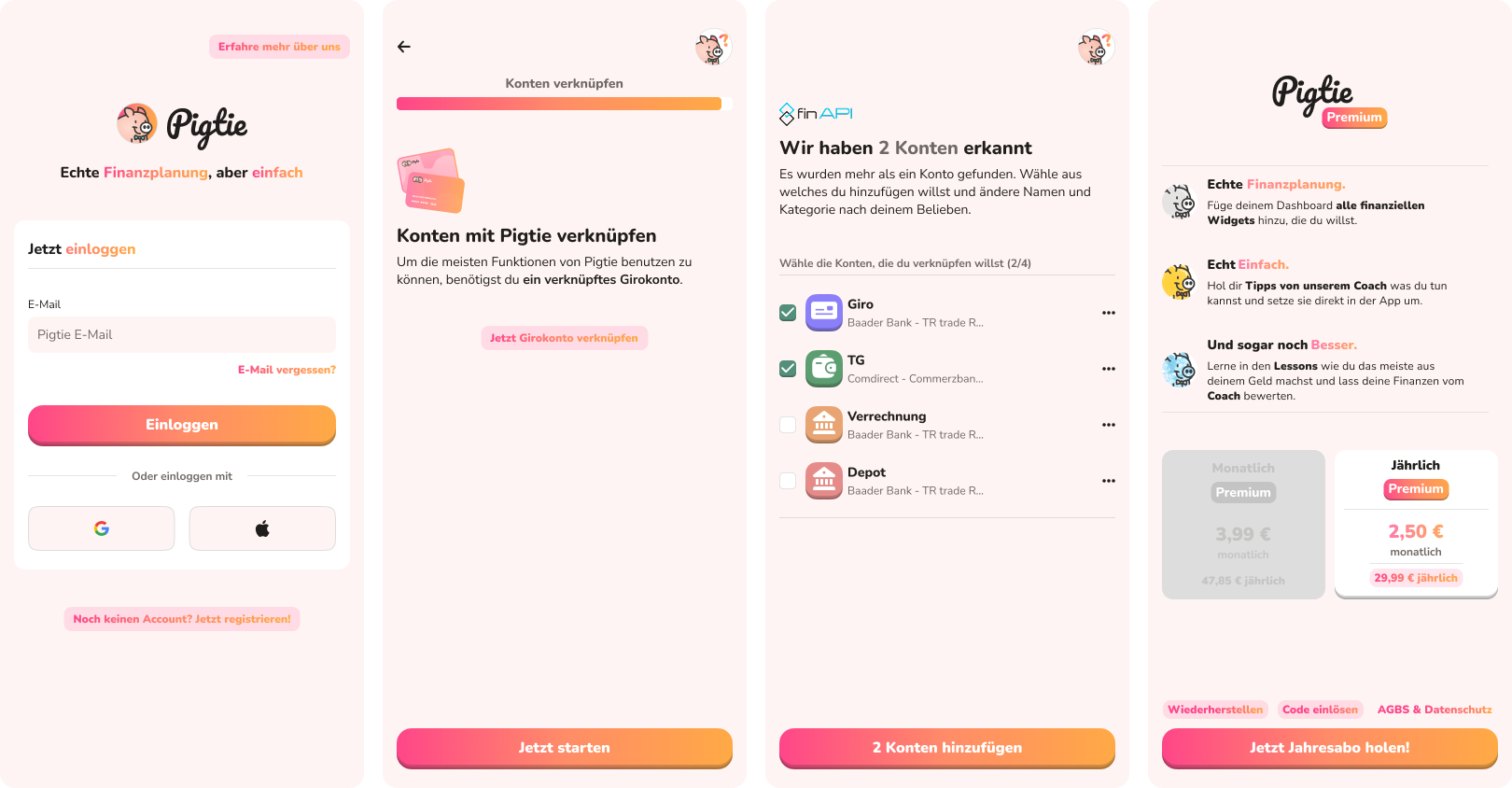
Pigtie is a micro-investing app designed to help younger users ease into investing by automatically rounding up small amounts from their checking account and routing them into a custodian account — quietly working in the background. This concept introduces an immediate product challenge: users must (A) connect their checking account via a PSD2 interface, and (B) either connect an existing clearing account linked to their custodian account, or open a new one through an affiliate partner within the app.
FinTech onboardings are inherently complex. They tend to be longer than typical digital onboarding flows, require information users may not have readily at hand, involve a significant amount of regulatory messaging, and deal with highly sensitive data. The goal of this project was to meaningfully improve conversion rates across the following funnel steps:
Since this was the first systematic study of the onboarding experience, the team prioritized asking the right questions over jumping straight to optimization. Rather than measuring conversion rates from the outset and adjusting blindly, the approach was exploratory: identify actual user pain points by speaking directly with potential users — not existing ones.
Key focus areas:
UX Methods:
All work was conducted within a User-Centered Design (UCD) framework, using controlled usability testing with a think-aloud protocol, followed by post-session questionnaires.
The live onboarding in the App Store was tested with 10 participants over two weeks. The group was deliberately heterogeneous within the target demographic (ages 18–32, ranging from no to limited financial literacy, none of them existing Pigtie users). Participants were selected based on expressed interest after hearing the product pitch, simulating a realistic lead scenario.
Sessions were framed as free-flow exploration across three tasks: account creation, bank connection, and custodian account opening. Each session included a task list, a test device (iOS and Android), a semi-structured interview guide used selectively, and paper prototyping materials for co-creation moments when participants had ideas to explore. Sessions concluded with the UEQ (User Experience Questionnaire). All sessions were screen-recorded, audio-recorded, and transcribed.
Findings were synthesized through thematic sorting and affinity mapping, resulting in the following key user stories:
Using the insights from Step 1, a functional click prototype was built rapidly in Figma. The modular structure of the prototype allowed screens to be added, removed, and rearranged quickly based on ongoing feedback. I built a complete user flow with screenshots to accurately understand every decision a user might face and document changes made over the testing of the prototype.
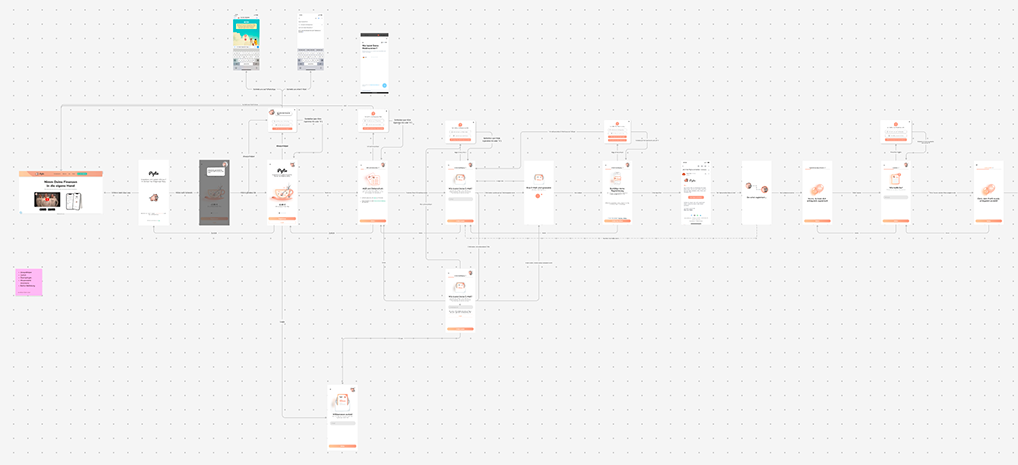
The new design introduced:
Trust & Security
Looking Around
Visual Quality
The revised prototype was tested with 7 participants over two weeks, drawn from the same target demographic. This round was more focused and evaluative: rather than generating new user stories, the goal was to validate the design decisions made in Step 2 and identify any remaining friction.
Sessions followed the same structure as Round 1, including the UEQ for direct score comparison.
Outcomes:
Following the final iteration, a dev handoff was completed with clearly defined goals and a finished high-fidelity design. Implementation work in Flutter included UI development and the rollout of a new design system and component library built on a variable token structure.
The results exceeded expectations:
Remaining challenges:
After this inital design, I had the opportunity to continue to improve the onboarding experience and make sure it works over the years, even when the conext of the app changes. This happened, when Pigties financial scope got broader - now Pigtie needed all accounts from the user to have an accurate picture of their financial situation. Below are some sample screens, which are also currently live in the app.
The project achieved its core goals: key metrics moved significantly, the quality of collected data was high, and the product improved in a meaningful and measurable way. The experience reinforced the value of face-to-face usability testing — particularly for a product in a trust-sensitive category where indirect signals can easily mislead.
What I would do differently: